4.5 Tips on Creating Killer Landing Pages
 4.5 Tips on Creating Killer Landing Pages
Creating killer landing pages on your site is a fundamental part of having a successful business website that not only gives you an amazing presence, but also brings value and revenue to people browsing on the web. So how do you create a killer landing page that will have viewers itching to sign up for your services?
Here are some of our basic tips to create Killer Landing Pages:
1. Simplified Branding: Make sure your viewer knows where they are, have a logo formatted simply and strategically placed on the page.
2. Call-to-Action Colors: Your call-to-action buttons should always POP. Use contrasting colors on your buttons to grab a viewer’s attention.
3. Less Text is More Text: Get to the point. People have short attention spans, lessen the text, and add more value.
4. Social Proof: Social credibility is gaining more and more traction everywhere, with search engines and with buyer influence. Add a social feed from one of your business social profiles to your landing pages to gain more creditability with viewers!
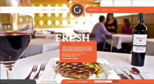
4.5 Create, Test, Repeat: Once you have one landing page, create another! Look at some examples of some killer landing pages that we love: GrooveShark, Everest, Simple


 RSS Feed

